Interactive analysis tool
What defines a university? New dashboard shows changing academic profiles
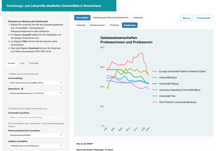
The data can be presented in various ways – for example, as a colour-coded chart, profile maps, growth rates or trends over time. Time periods and comparison groups can be selected individually. // Screenshot: University of Wuppertal
The dashboard brings together an extensive long-term database and makes it readily accessible. It is based on data from the Bibliometrics Competence Network (KB) and the Federal Statistical Office. Among other things, it takes into account professorships, non-professorial academic staff, students, core funding and third-party funding. Users can select specific universities, subjects or academic fields and track their development over time.
“The dashboard reveals trends that are difficult to discern from individual snapshots. A view spanning almost three decades reveals which subjects are gaining in importance, where universities are expanding their areas of focus, and how their structures are changing in the long term,” explains organisational sociologist Prof. Dr Thomas Heinze, who is leading the project at the University of Wuppertal.
Highlighting strengths, priorities and changes
This makes it possible, for example, to examine which subjects have a particularly strong influence on a university’s profile, where institutional priorities are shifting, or which disciplines are growing or shrinking over the long term. Technical and non-technical universities can also be compared with one another.
The focus is on the so-called Relative Specialisation Index, or RESP for short. It shows the extent to which a university specialises in certain subjects within a defined comparison group. This reveals not only how large a subject area is at a university, but also the significance it holds for the profile of the institution in question.
“Our dashboard is not a ranking. It does not rank universities. Rather, the focus is on monitoring their subject-specific priorities in research and teaching. The aim is to highlight profiles and their development – not to weigh up universities against one another,” explains Prof. Dr Thomas Heinze.
Tailoring data presentation
The data can be presented in various ways – for example, as colour-coded charts, profile maps, growth rates or trends over time. Time periods and comparison groups can be selected individually. Graphs can be exported as PDF or PNG files; the underlying data is also available as Excel files.
The dashboard is therefore aimed at different user groups. For higher education research, it provides an empirical basis for analysing long-term changes and specialisation processes. The data can also provide relevant points of comparison for higher education planning and science policy.
University profiles that everyone can understand
Furthermore, the tool provides easy access to information about the academic structures of German universities. Prospective students and the wider public can use it to gain a nuanced understanding of which subjects play a particular role at which universities and how these areas of focus have developed. A user interface in both German and English, along with a detailed manual, makes it easy to use.
The dashboard is part of the documentation project ‘Academic Research and Teaching Profiles of State Universities in Germany’. Version 2026 was developed by Prof. Dr Thomas Heinze, Dr Dirk Tunger, Tobias Grabosch and Rafael Josek.
A user guide and a practical guide make it easier to get started with the dashboard. They highlight the key functions and offer suggestions on how the data can be used to address different research questions.
Go to the dashboard:
https://fachprofile.shinyapps.io/fachprofile/
Further information on the project:
https://fachprofile.uni-wuppertal.de/