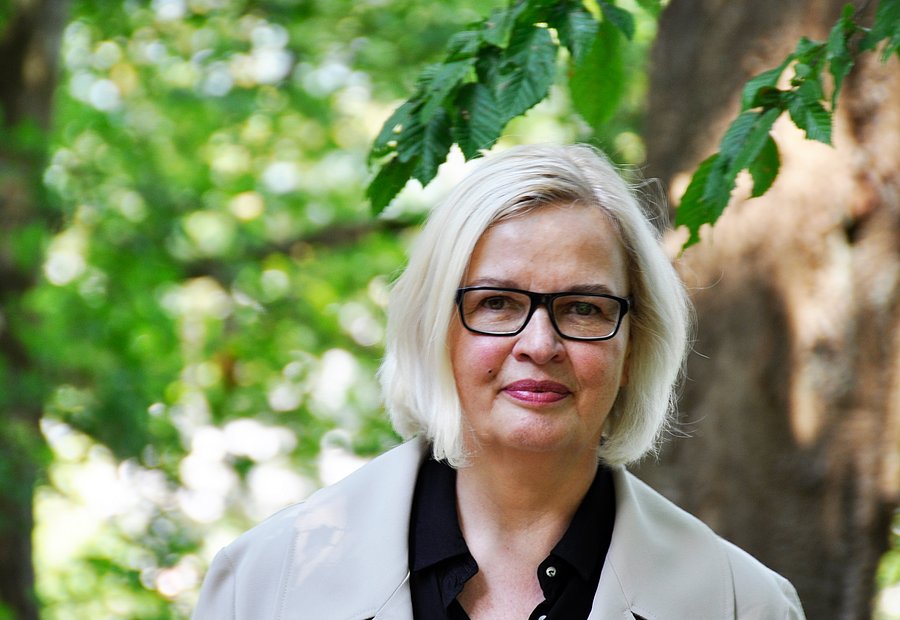
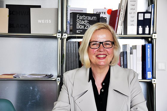
Prof. Dr. Annemarie Neser / Design and Art
Photo: UniService Transfer
Colour-intensive and achromatic times in architecture
Prof. Dr.-Ing. Annemarie Neser, Professor of Building Culture and Interior Design, on the significance of colours in architecture
"In architecture, colours define volumes, emphasize components, set off or highlight surfaces," says Annemarie Neser, who holds a doctorate in architecture and has been Professor of Building Culture and Interior Design in the Faculty of Design and Art at the University of Wuppertal since October 2018. For six years she was head of the Werkraum Berlin for the Zurich "House of Colour" and was intensively involved with architectural colourfulness and colours in a historical context. "Colours support the architectural form or they counteract it subversively," she explains and gives an example from her published book (Farbstrategien in der Architektur) on which she is a co-author. "The Swiss architectural office Knapkiewicz + Fickert enables alternative readings of architecture by placing colour as a kind of mask on the architectural surface; volumes or scales then change completely. Colour can strengthen or weaken spatial boundaries, and this in turn can be well observed in Berlin's modernist housing estates, such as the Waldsiedlung Onkel Tom's Hütte in Zehlendorf. Here, the theme of colour clarifies, models, separates, leads." Historically, only certain colours have been used often in certain buildings, and then the human being comes into play, who with his individual memory of colours also connects feelings such as affection or rejection.
Dominant colours in Wuppertal
In Wuppertal, in Neder's experience, the cityscape is dominated by rather achromatic colours, "i.e. beige, white, gray or brown tones up to deep anthracite", and this always varies from region to region. "In Wuppertal and the Bergisch Land the regionally typical mixture is the Bergisch Triad, the special mixture of white, green and gray-black". In retrospect, colour trends can be easily identified, which can then each be considered typical of an epoch. "There is always a change between colour-intensive times and times in which achromatic material colours are being preferred", explains the scientist and describes exemplarily the epochal periods of the 20th century. At the beginning of the century, the emphasis was on the rediscovery of regional colour traditions, and almost everywhere this led to the period of the so-called "coloured city" in the 1920s. Bruno Taut (German architect and urban planner) is a renowned example of this, who as a representative of the new construction was also responsible for the Berlin Uncle Tom settlement mentioned at the beginning. "The 1960s," she continues "were then rather a period of achromatic tones and material colouring, glass, anodized aluminum, exposed concrete, and it is the time of exposed aggregate concrete. The 1970s are colourful again, due to developments in the paint industry, and in some cases colours from outside the architecture were preferred. As an example, she names the Berlin subway stations of this period, designed by Rainer G. Rümmler (Berlin's director of construction at that time).
Wuppertals secrets under the white limewash
Wuppertal's Old Town area with its Brill Quarter and Luisenstrasse offers an abundance of historical buildings whose original colourfulness is hardly recognizable today. "I am convinced that the colour scheme during the foundation period was much more differentiated in the colour picture and that all building details, i.e. the cornices, friezes, pilaster strips, were probably accentuated by colour," Neser assumes "because that is very typical. Pedestals, storeys or window axes were actually coloured in buildings during the foundation period". Ultimately, this always depends on the time of origin of the building, the building historian explains, because even in the 19th century there were already epochs of colour. "This has to do with the fact that historical knowledge increased and colour chemistry developed. Especially in historicism, these possibilities were used for polychrome facades; for example, new findings about the colourfulness of Greek or Roman temples were often the basis for colour settings on facades until the 1870s and 80s. At the end of the century, muted, dull colours became the preferred trend. How exactly it looks like under the facades of Wuppertal remains a mystery at first and may provide material for a new research project. "We would have to conduct extensive research together with the Preservation of Historical Monuments," says Neser "because how strategically the builders in Wuppertal proceeded remains hidden under the whitewash, for the time being. I believe that many of today's owners would be very astonished, if they could see in a visualization what the building might have originally looked like".
Wuppertal's wonderful vertical
Brockhaus writes in his 2006 edition: "Aesthetics views taste or good taste as 'the ability to distinguish and judge between the beautiful and the ugly' ". The spirits have long been divided on this issue at the tower of the Stadtsparkasse in Wuppertal, and yet today's monument is an impressive building in the center of Wuppertal. Built in 1973, according to the plans of the renowned architect Paul Schneider-Eisleben, Neser considers this building to be "plastically exciting" and speaks of a "high-quality, sculptural city body". "When I first came to Wuppertal, at the time of the great Döppersberg reconstruction, I discovered this slender, high-rising structure full of curiosity above the construction site. For me it was a charming vertical above the horizontal band of the suspension railway, which I also consider an absolutely impressive industrial monument. It impressed me with its aesthetic balance and the coherence of the interplay of the three construction volumes. It is a successful example of its time of origin. I like this sparseness, this purism and also the way it shows the construction".
Sustainable colours
In addition to Wuppertal's achromatic tower, colours play a central role in architecture again and agaib and are now also tested for sustainability. "Often the wrong colours are put on the wrong surfaces", commiserates Neser "and then there are cracks or larger chipping". The surface of a building is a more or less well-functioning system. Coating and substrate have to work well together. If this interplay succeeds, it maintains the lifespan and results in a correspondingly lower consumption of resources. "All manufacturers now offer sustainable products. All sorts of everyday things, such as potato starch, linseed oil or hemp can be used." In her opinion, many facades could be used for longer, if the aging and weathering processes of the surfaces were taken into account from the very beginning. In the best case, the visible signs of aging could be read as quality or venerable patina.
Colour decisively influences the character of rooms
Colour also plays an important role in interior design. "Colour influences the character, atmosphere and understanding of architecture," Neser clarifies, because it defines, neglects or emphasizes. The use of colour always depends on the context. Every room, every architectural volume has its own needs and characteristics. "With colour there are no recipes. Colour is complex, extremely changeable in the interplay and powerful!" In order to introduce students to the many different ways in which colour can be used, Neser offers a wide range of practical courses in her field. "We deal with the atmospheric design of rooms, with design principles, design processes, techniques of restoration, imitation and decoration are explored, surface coating is also an important topic, and much more. The major projects in the field of colour and interior design bring together the knowledge from theory and practical courses".
The quality of urban planning
Neser closely monitors the development of the city and, as an expert, has valuable ideas on urban development and urban planning in order to maintain or introduce existing quality. "Architecture is omnipresent, we cannot escape it, neither in the city nor on the countryside. In my view, it is important to know the needs of the people who live, reside and work in this architecture. We should be concerned with the impact of architecture, much more than we have done so far." The built world that surrounds us is supported by a certain image of humans, it gives a direction of use and ideally makes people feel invited and relaxed. Architecture can create a variety of atmospheres that enable different social groups to work together. And colours play a very important role here. "Architecture is much more than just a built object".
Uwe Blass (Interview on 08.06.2020)
Prof. Dr. Annemarie Neser received her doctorate from the Faculty of Architecture at the University of the Arts in Berlin with a thesis on Prussian monument preservation. Since 2007 Prof. Neser worked as a lecturer at the Zurich "House of Colour", whose Berlin branch she headed from 2010. From 2014 to 2017 she was a research assistant at the University of Wuppertal in the Department of Visual Communication Didactics and coordinator of the interdisciplinary educational platform "colour.education". Since WS 2018 she has been Professor for Building Culture and Interior Design in the Faculty of Design and Art in Wuppertal.