Colours create well-being
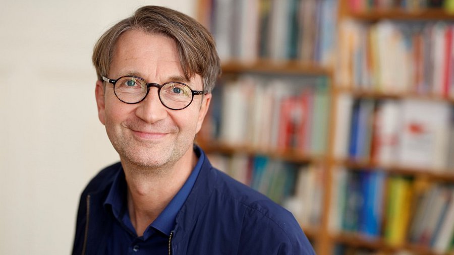
Prof Dr Axel Buether / Didactics of visual communication
Photo: Martin Jepp
Colours support well-being, behavioural motivation and health
Axel Buether, Germany’s leading colour expert on colours in public facilities
Colours unconsciously play a major role in our lives. Axel Buether, professor of “Didactics of Visual Communication” in the School of Art and Design at the University of Wuppertal and Germany’s leading colour expert, conducts research with his students on the effect of colours on us humans at work in public facilities and in everyday life.
Clinical environment or feel-good environment
“We started a study at Helios University Hospital Wuppertal in 2016,” Buether reports. ”At that time, the year of delirium had been proclaimed. A delirium is a common post-operative symptom. In clinical practice, it is often treated with psychopharmacologic drugs. They are used to calm patients, especially if they suffer from hallucinations or develop severe anxiety. The problem is that these drugs can have considerable side effects and increase the risk of complications for patients who have recently undergone surgery - including increased mortality. With this in mind, the head physician posed the question of whether environmental factors - specifically the atmosphere of a room - could also help to reduce the stress for patients and thus minimise the use of pharmacological drugs.
“As part of upcoming renovation work, we simply had the walls and ceilings repainted and the light fittings replaced,” Buether explains. “We used modern, energy-saving LED lights with a high colour rendering index of 90, which create an almost natural lighting atmosphere. The colours in the room remain authentic because the full colour spectrum is retained, which is a decisive factor for the visual perception of vitality and interpersonal resonance.” This measure was almost cost-neutral and led to a noticeable improvement in the atmosphere. “The patient suddenly no longer looks so pale and sickly. The carers’ emotional empathy is also visible again, e.g., through the natural reddening of the face. It is precisely these visual indicators of health and empathy that are largely eliminated by the unnatural light of neon and energy-saving lamps and unfavourable room colours. These light sources reduce the warm spectrum, faces appear pale, rooms appear cold and distant.”
The effect was measurable: the simple, cost-effective colour and lighting intervention led to an average reduction in the use of psychotropic drugs of 30 percent in all intensive care units. There was also a clear side effect on staff: in the newly designed corridors and break rooms, the sickness rate fell by a third on average in the following year. Buether's appeal to decision-makers is clear: ”When planning healthcare, educational, office and residential buildings, pay consistent attention to atmospheric factors such as light and colour. They have a significant influence on the well-being, health and motivation of users.” A modified space not only promotes recovery, but also social interaction. “In the break room, employees suddenly no longer just talk about their work. They really switch off, dedicate themselves to eating, regenerating - and talk more about private topics. This reduces stress and strengthens social ties in the workplace.”
What is particularly remarkable is that implementing these measures involves no or only minimal additional costs. “Everything I suggest is either cost-neutral or even saves money in the long term. All it takes is a conscious decision in advance. Whether a wall is painted white or an ochre colour makes no difference to the craftsman. Even with floors or furniture, the choice of colour is usually irrelevant in terms of price.” Buether emphasises: “I'm not the interior designer who makes a project more expensive. I show how you can achieve a much more positive effect for everyone involved with the same budget.” ”You can definitely inspire clients and planners to change their culture,” the expert says. “What we started in Wuppertal has now had an enormous impact: The Helios management has decided to take these findings into account in future, which will bring about a cultural change at the Group's 100 or so clinics.”
For Buether, one thing is at the centre here: “This form of empirically based, applied research gives us as designers a social impact that goes far beyond what an individual design project can achieve. Education and the transfer of science are more important to me than a single local intervention - because this is precisely where our responsibility lies in the context of university research: actively helping to shape necessary social transformation processes.”
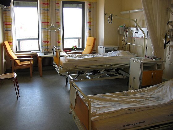
A classic hospital room
Photo: public domain
Colours can measurably reduce anxiety
In collaboration with the Chair of Clinical Psychology, Buether submitted an application for research funding. The aim is to record scientifically and reduce the anxiety of breast cancer patients effectively before radiotherapy. “Together with medical research partners, we want to reduce the fear of radiotherapy through targeted interventions in colour and lighting design - and at the same time create a transferable model project for this area,” Buether explains. Three years ago, he founded the Institute for Evidence-Based Colour Psychology, which pursues this approach. “We work in a participatory way - with a representative selection of actual users. It's not the clinic manager who sits at our table, but the nurse or the person who has to explain to frightened women in the previously clinically white rooms how radiotherapy works.”
A central element of the intervention is the targeted design of the viewing direction: the patient sits with her back to the device and looks at a colourful wall that evokes positive associations, while the specialist explains the procedures to her in a calm atmosphere. “If we are successful with our intervention, a new room atmosphere is created that contributes to relaxation and noticeably reduces the patient's anxiety.” Buether emphasises: “Colours do not have a purely aesthetic function - they are a language based on biologically explainable principles. It shapes people’s experience and can lead to measurable changes in behaviour.” What can be scientifically proven is therefore not the ’beauty’ of colour, but its effect. “ I can measure the psychological influence of colour on anxiety, stress and orientation. However, I don’t want to measure whether someone personally finds a certain colour beautiful. That is subjective - and should remain this way.”
Restoring the therapy capability
At his Chair of Media Design and Design Technology at the University of Wuppertal, Axel Buether supervises doctoral and master’s students who are increasingly studying the effects of colour. “I take them to a forensic psychiatric ward, for example,” he explains, “where they research how a targeted change of atmosphere can open up access for therapeutic work even in patients who, according to medical judgement, are not capable of therapy.” Buether reports a particularly impressive case: a patient classified as unfit for therapy was confronted by one of his doctoral students with twelve large-format images of archetypal landscapes - including mountains, coasts and steppes. While the patient was reacting apathetically to some of these pictures, he showed strong emotional reactions to certain motifs, accompanied by clear changes in behaviour. “These reactions allow us to recognise which image content triggers resonance - and give us clues as to how spaces need to be designed in order to enable access to the person in the first place,” Buether says.
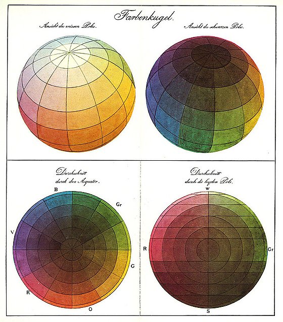
Philipp Otto Runge's colour sphere around 1810, photo: public domain
The colour sphere is one of many ways of arranging the hues in a three-dimensional colour system.
Colours in our everyday lives - between effect and perception
Colours are omnipresent - and yet we usually perceive them unconsciously. ”This is because,” Buether explains, “different areas of our brain are responsible for language and colour perception. While we almost always communicate consciously through language, our experiential knowledge of colours is intuitive and therefore eludes direct conscious control in most everyday situations.” As a result, we make decisions based on colours every day - when shopping, choosing products, assessing people or rooms - without knowing exactly what criteria we are using to make our judgements. ”This is precisely why we can be manipulated in this area - and often make the wrong decisions,” Buether warns. As a sought-after colour expert, he is often asked for advice - especially when well-intentioned design leads to undesirable effects. A typical example: “You often hear children would need a colourful environment. This is partly true, because monochromatic environments such as pure white environments have negative effects such as sensory deprivation. However, if you make it too colourful, you encourage excessive activity, boisterous behaviour - which is not desirable in many situations. Overstimulation can even favour symptoms such as ADHD because children are constantly activated - instead of calming down or concentrating.” Buether was particularly impressed by the case of a children’s intensive care unit that an artist had designed in good faith with bright colours to create a supposedly anxiety-free environment. “The result was the opposite: the staff, who had to spend the whole day there, suffered from massive concentration problems because there was no opportunity for mental relaxation.” Buether based the redesign on the age-related needs of the children - and the staff. “Young children need an age-appropriate environment, with activating and calming atmospheres depending on use. Strong signal colours such as blood red, poison green or neon orange as well as colour combinations such as yellow-black or red-black encourage restlessness- These are biologically anchored warning colours.” Dark colours are a problem for many children because they can trigger anxiety and lead to rooms being avoided.
Buether puts it in a nutshell: “It's like cooking: If you don't use any spices, the food tastes bland. If you add too many, you spoil the best dish. If you work with colours, you have to understand their complex effects on human nature and use them in a measured way.”
My very personal colours
In his first book The Mysterious Power of Colours Buether wanted to shed light on the biological and cultural causes of the effects of colours and make scientific findings usable for civil society. In his new work, the scientist now goes one step further: he works with a spectrum of over 2,000 shades of colour and focuses on people. “Everyone has a wardrobe,” Buether says. ”According to sustainability research, the average woman in Germany owns around one hundred different tops, a man around seventy. If only half of these differ in colour - even in nuances - there are millions of possible combinations. Nevertheless, most people reach for the same tried-and-tested pieces every morning - out of insecurity or fear that other combinations won’t work.” However, if you understand the effect that colours have on your own well-being and on your public image, you can make more conscious and sustainable decisions - when buying clothes, designing your home or choosing everyday objects. “I can furnish my home in a way that makes me feel good. Colours provide my nervous system with emotional information within fractions of a second - long before I consciously perceive what I see. I enter a room; the colour puts me in the right mood - and I immediately start subconsciously looking for reasons why I feel good there.” Buether is convinced that those who know more about colours can make well-founded, coherent decisions for themselves - in clothing, furnishings or product selection. He aims to answer precisely these practical everyday questions in his new book - based on evidence-based research. At the heart of the book is a personality test that helps readers to discover their personal colour preferences and their significance.
The most frequently named favourite colour is blue
“If you ask people in Germany about their favourite colour, blue usually comes first,” Buether explains. ”Blue is also at the top of the list worldwide - while brown usually brings up the rear.” Interestingly, however, this ranking is not reflected in our everyday lives: “In many homes, we find wooden furniture, linen textiles and countless everyday objects in natural brown and earthy colours. Almost all natural textiles are brown, as are many spices and furniture - and yet this colour is hardly ever mentioned as a favourite colour.” For Buether, the reason lies in social perception. “When we are asked, we name something that represents us positively. Blue stands for openness, expansiveness, trust - that goes down well. Brown, on the contrary, is considered by many people as stuffy, old-fashioned or difficult to categorise. So, it is avoided. The answers are therefore often socially filtered and not authentic.”
An impressive example is provided by an experiment that Buether carried out with schoolchildren for a ZDF television series: “All the children cleared out their wardrobes and laid out their clothes in a circle in a gym. Then we asked: Can you guess which circle belongs to whom based on the colours?” Surprisingly, all 30 children correctly matched up their classmates - and were able to give reasons for their assignments. However, when asked about their favourite colour, not a single child gave an answer matching the actual colours of its clothes. “Boys who actually liked pink or purple said that these colours were not cool for boys. They didn’t want to risk that their classmates make fun of them,” Buether explains. The social environment - the milieu - therefore has a strong influence on what colours people allow themselves to wear. “A boy who still liked apricot as a six-year-old says as a seven-year-old: I won’t wear that colour any more. The colours then disappear from the wardrobe - not because they are no longer liked, but because they are not socially accepted.”
This influence is the real ’power of colours’, Buether thinks. If you choose the wrong colour, you lose resonance - products are not bought, flats are not rented, hotels and restaurants are not booked. “Hospitals need to be occupied - but the wrong colour scheme makes people feel sicker. Schools need to be full - but children learn less well and teachers feel exhausted more quickly if the atmosphere isn't right.” His conclusion is clear. “We have to stop thinking in such simple categories as 'favourite colour'. It leads in the completely wrong direction.”
Colours motivate learning
According to Buether, it is important to engage consciously with the use of colours - and to keep asking questions. “Where do certain colours occur in nature? What character traits and needs do they appeal to? And how do they specifically affect our behaviour?” Especially in a school context, colours can have a significant influence on learning behaviour. “In classrooms where work needs to be concentrated, a light, cool atmosphere has a supportive effect,” Buether explains. Slightly tinted white walls and ceilings, combined with a coloured accent wall in muted shades of blue or green such as bluey-grey or sage green, are ideal. A warm floor - in a wood look, for example - provides the necessary balance and gives the room a friendly, inviting atmosphere. The whole environment is complemented by luminaires that emit cool white light similar to daylight or sunlight at midday.
For Axel Buether, one thing is clear: in a good schoolhouse children do not need one atmosphere, but many. This is necessary because the spatial environment has to meet different demands when children learn, are creative, relax, move, and interact socially. - Therefore light, colour, materiality, and room structure have to meet different demands as well. ”Concentrated work requires a cool, bright and restrained atmosphere - clear, structured and without visual stimuli that distract.” The situation is completely different in creative spaces: “It can be inspiring, stimulate the imagination, with lively colour accents and an open interior design that encourages creative thinking.” Recreational areas and places for social communication, benefit from cosy, warm, calming colours that convey a sense of safety and security. In dining halls and eating areas, a sensually activating design is required – with an appetising effect and a sociable and open atmosphere. And sports and leisure areas need an atmosphere with a mobilising effect that release energy and support group dynamics. “ Through light, colour and space, each of these atmospheres has a direct effect on our behaviour. If used correctly, each can significantly improve learning, well-being and social quality in everyday school life,” Buether summarises.
Uwe Blass
Axel Buether is Professor of Didactics of Visual Communication at the University of Wuppertal with a research focus on media studies, perceptual psychology, colour psychology and visual communication in space.